
I have to admit that I’ve neglected this site. In my defence, I’ve been busy with Diplomaticon Quarterly, my Diplomacy eZine.
But I’m back here, if only briefly (as I have an upcoming issue of DQ to publish at the start of March and I’m putting it together).
For this post, I wanted to let you all know that I’m going to be changing the maps I use for my posts, when I use them. The reason for this is the loss of Diplicity, the website I was using for images.
Now, I’ve tried using other sites. Playdip has an ‘Orders Resolver’ that does what it says on the tin. However, unfortunately, it doesn’t show an image. Backstabbr and webDip have sandboxes. Backstabbr only provides a link to the sandbox; webDip uses the old, incredibly ugly, map rather than the beautiful map it uses now.
So, the only way I can do this is either use my own maps, or put up with the pain of using webDip’s old, urgh of a map.
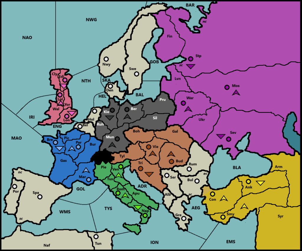
Now I like the map I designed based on the DBNI’s map, but I thought it was time to put a new one together, so here it is:
I’ve used the colour scheme from the European version of the board, roughly. This is because it’s easier to use colours for power names on this background:
- England
- France
- Italy
- Germany
- Austria-Hungary
- Turkey
- Russia
Germany is dark grey rather than black because, well, it’s difficult to use black with a black outline. I could have gone for a white outline, I guess, but I prefer black. I’ve made Austria a little redder than the current Euro board, and Turkey and France a little darker.
Some of the spaces are a little misshapen, simply to provide space for SCs, names and units. Clyde, for instance, and southern Italy. But, apart from that, it’s pretty standard. I have removed the straits that separate Asiatic Turkey from European Turkey, and the unnecessary sea space separating Denmark and Sweden. I chose to keep Sicily on the map because that means it’s a reference for the Sicilian Axis, but I’ve removed Ireland and Iceland as not being a part of the game.
I’ve used arrowheads to represent armies – because circles would be confused with the SCs (and it looks a little like an A) – and triangles for fleets. SCs are, therefore, circles, because the idea is that the colour of the SC will change to represent ownership, matching the colour of the units.
Overall, I think it’s a pretty clean map. No irrelevant islands, and generally pretty clear (although Liverpool looks like ‘Lol’ rather than ‘Lpl’ with a unit there, unfortunately; still you’ve gotta laugh, eh?).
I’m a little worried what it will look like with movement arrows on, especially with shorter arrows, but we’ll see. Lpl-Yor could be ugly.


Leave a comment